Our goal at HPR Graphics is to help you create a believable world by filling it with objects that convincingly belong in the context of a set piece. When we get lucky and the script warrants, we produce items to actually help move story or character along. Technology has gifted us with cool new toys to help us fabricate a realistic chip bag, soda can, shrink wrapped bottle or candy wrapper. But, the design challenges remain the same.
Good prop packaging design blends many areas of expertise. It requires you be a copywriter, an amateur ad exec, a typephile, an expert mimic, a student of logos and corporate identity marks and styles throughout the decades. It also helps if you’re willing to nerd out over all those little details that make packaging feel real.
Our latest product props illustrate the broad spectrum of requests that come our way on a daily basis. To see more HPR Graphics designs like these visit http://www.hprgraphics.net.
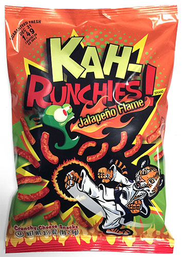
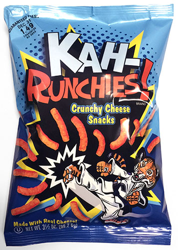
The “Look Alike”
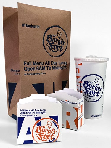
At first blush, mimicking real packaging is a good option. The object is recognizable, but otherwise avoids clearance issues. Right? Well, not always. Instead of seamlessly substituting for a brand we immediately recognize, the look-alike can carry with it some danger of becoming oddly distracting, even unintentionally humorous. It can be legally fuzzy to say the least. The look-alike is deceptively simple to execute. After all, there is a blueprint to follow. And yet, once you replace all the brand elements with different words and tag lines, new design problems pop up. It’s not as simple as replacing “White” with “Burger” and “Castle” with “Fort”. These new letters had to be coaxed and finessed into a logotype that looked good in its new incarnation, yet still like the real thing.
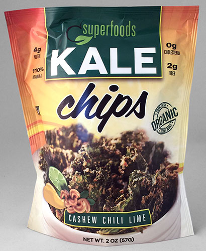
The “Original”
An original package design is fun and freeing, but adds additional sweat equity by having to be your own art director. Starting with a blank canvas can also be extra challenging on a tight deadline. Our goal, as with everything else, is to make our originals feel like they could co-exist on a real store shelf. Fortunately, we’ve learned short cuts and amassed flexible templates over the years to nudge the process along.

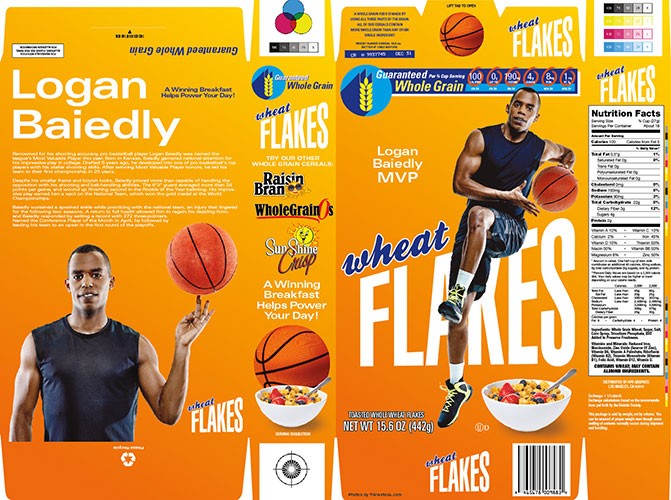
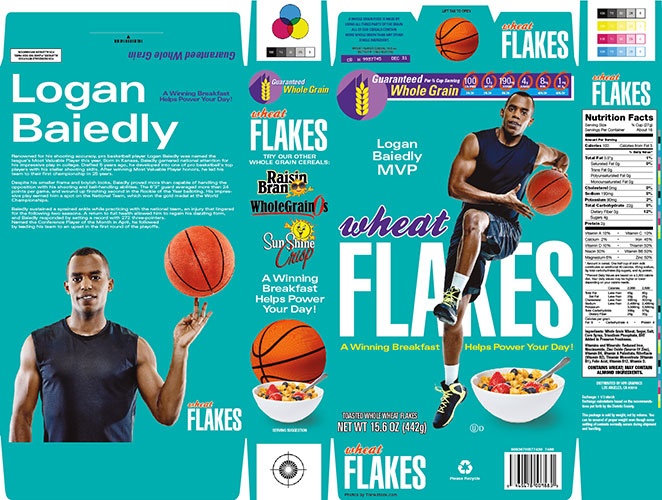
The “Feel Alike”
This approach blurs the lines between the two, and has become very popular. But, the feel-alike can be a delicate dance that requires a bunch of judgment calls, with no clear rules to follow. What is the fine line between infringing on design trademarks and copyrights, and vague design homage? The Wheat Flakes design direction given to us was as follows: The telltale orange background was deemed too close to the real thing, hence the change to a more subtle gradient. On the other hand, aping the scaling logo type treatment was deemed appropriate. As we got further into the project, we decided to create another variation that was one more step removed. This resulted in changing the background color and eliminating the scaling logotype effect entirely. The similar layout, typography and presence of a sports figure seemed feel-alike enough.
In the end, there are no right or wrong answers. It may simply come down to a matter of taste, or to those varying hurdle heights legal departments devise for us to clear. What we aim for is to provide you with plenty of options and expertise to help your project along.